If you have spent any time reading about trading performance, you have met the Sharpe ratio. It is the number the finance industry reaches for when it wants to sound rigorous. It shows up in fund fact sheets, backtest reports, and every “what is a good Sharpe ratio” article on the internet.
Here is the honest truth from someone who has traded systematically for over 20 years: I rarely use the Sharpe ratio as my primary metric. It has a place, but for practical, rules-based systematic trading it can quietly mislead you into rejecting a good system and keeping a fragile one.
This guide covers what the Sharpe ratio is, how to calculate it, and what a good number looks like. Then it goes where almost no other article does: the four things the Sharpe ratio hides from a working trader, and the metrics I actually use to decide whether a system is worth trading real money.
What is the Sharpe ratio?
The Sharpe ratio is a measure of risk-adjusted return. It tells you how much return a strategy generated for each unit of volatility it took on. A higher Sharpe ratio means more return per unit of risk, at least by this particular definition of risk.
It was developed by Nobel laureate William F. Sharpe in 1966. The idea is simple and genuinely useful: raw return means nothing without context. A system that made 30% per year by swinging violently up and down is not obviously better than one that made 20% in a straight line. The Sharpe ratio tries to put both on the same scale.
The catch is in that phrase “this particular definition of risk.” The Sharpe ratio defines risk as the standard deviation of returns – how much the returns wobble around their average. For a systematic trader, that definition is where the trouble starts, and we will come back to it.
What is the Sharpe ratio formula?
The Sharpe ratio formula is:
Sharpe Ratio = (Rp – Rf) / σp
Where:
- Rp = the return of your portfolio or trading system over the period
- Rf = the risk-free rate (typically a short-term government bond or Treasury bill yield)
- σp = the standard deviation of the portfolio’s returns (the volatility)
In plain language: take your return, subtract what you could have earned risk-free, and divide the result by how much your returns bounced around. The numerator is your excess return. The denominator is your volatility.
One point that trips up traders working from backtest data: the Sharpe ratio is almost always annualised. If you calculate it from daily or monthly returns, you scale it up by the square root of the number of periods in a year (roughly the square root of 252 for daily data). That square-root scaling matters, because it means the bar frequency you calculate from changes the headline number. The same system can show a different Sharpe ratio depending on whether you measured daily, weekly, or monthly returns.
How do you calculate the Sharpe ratio?
To calculate the Sharpe ratio, follow four steps:
- Find the average return of your system over the test period.
- Subtract the risk-free rate to get the excess return.
- Calculate the standard deviation of the period returns.
- Divide the excess return by the standard deviation, then annualise if needed.
Here is a worked example. Suppose a system returned an average of 12% per year, the risk-free rate was 4%, and the standard deviation of annual returns was 10%.
Sharpe Ratio = (12% – 4%) / 10% = 8% / 10% = 0.8
That is it. The mechanics are trivial. The hard part is not calculating the Sharpe ratio – it is knowing how much to trust it, which is where most articles go quiet.
What is a good Sharpe ratio?
As a rough industry guide, Sharpe ratios are often graded like this:
| Sharpe Ratio | Common Interpretation |
|---|---|
| Below 1.0 | Sub-optimal / poor risk-adjusted return |
| 1.0 to 2.0 | Good |
| 2.0 to 3.0 | Very good |
| Above 3.0 | Excellent |
This is the scale that dominates search results and gets repeated by every AI assistant. It is fine as far as it goes. But it comes from the world of hedge funds and diversified portfolios, and it sets a dangerous expectation for a private trader running end-of-day stock systems.
Here is the reality check. A robust, genuinely tradeable long-term stock system will often sit at a Sharpe ratio somewhere around 0.7 to 1.3, and that is completely fine. If you build a single end-of-day system showing a backtested Sharpe of 3, your first reaction should not be excitement. It should be suspicion. A number that good on a single system usually means you have curve-fitted the backtest, used too few trades, or accidentally engineered an outcome that will not survive live trading. Your maximum drawdown is always ahead of you, and a suspiciously smooth backtest is often hiding it.
What does a negative Sharpe ratio mean?
A negative Sharpe ratio means your system returned less than the risk-free rate over the period. In other words, you took on volatility and were not even compensated with a return better than parking the money in Treasury bills.
One important nuance: when returns are negative, the Sharpe ratio becomes hard to interpret sensibly. A more volatile losing system can show a “less negative” Sharpe than a stable losing system, which is the opposite of useful. So do not read too much into the precise value of a negative Sharpe ratio. The signal is simple – the system did not earn its keep over that window – and the exact number is noise.
How do systematic traders actually use the Sharpe ratio?
Systematic traders use the Sharpe ratio as one input among several, never as the single number that decides whether a system lives or dies. It is a quick sanity check on whether returns are reasonable relative to volatility, and it is useful when comparing to an external benchmark. But it never gets the final vote.
The reason is that no single metric tells the whole story. When I evaluate a trading system, I look at trade-level statistics to confirm the edge is real, drawdown figures to check I can psychologically survive the system, and return metrics to confirm it is worth running at all. If something looks wrong in out-of-sample testing, the first thing I check is whether the trade-level stats – percent winners, average win, average loss, and expectancy – remain stable. If those hold up, the system is probably still working even if the headline Sharpe looks weak because of a difficult market period.
That layered approach exists precisely because the Sharpe ratio, on its own, hides things a trader cannot afford to ignore.
What are the drawbacks of the Sharpe ratio for a trader?
The Sharpe ratio has four serious drawbacks for a practicing systematic trader. Each one can lead you to reject a good system or trust a fragile one. This is the part of the story the textbooks skip.
1. It penalises upside volatility
This is the big one, and it is the reason I stepped away from the Sharpe ratio years ago. Standard deviation is symmetric – it treats a huge winning month exactly the same as a huge losing month. Both increase your volatility, and both drag your Sharpe ratio down.
Think about what that means for a trend following system. The entire edge of trend following is asymmetry: lots of small losses and occasional enormous winners. When one of those monster winners finally hits, your standard deviation spikes, and your Sharpe ratio drops. The metric penalises you for doing exactly what the system is designed to do.
The practical consequences are perverse. Your Sharpe ratio can fall right after your best month. If you use volatility to size positions, you might cut exposure straight after a period of strong performance. A risk report can flag your system as elevated risk at the very moment it is working perfectly. High volatility in a trend system during a strong trending period is usually a sign of health, not danger, and the Sharpe ratio cannot see the difference.
2. It assumes returns are normally distributed
The Sharpe ratio implicitly assumes returns follow a normal bell curve. Real market returns do not. They have fat tails and skew – extreme moves happen far more often than a normal distribution predicts, and the big crashes cluster.
For a systematic trader this matters because the Sharpe ratio will systematically understate the risk of the rare, brutal event. A strategy can post a beautiful Sharpe ratio for years while quietly carrying the risk of a catastrophic loss that the standard deviation simply never captured. According to Institutional Investor, Long-Term Capital Management boasted a glowing Sharpe ratio of 4.35 before it collapsed in 1998, nearly taking the financial system down with it.
3. It is easy to game and curve-fit
Because the Sharpe ratio is a single number built from two inputs, it is easy to inflate if you are optimising for it – deliberately or not. You can improve a backtested Sharpe ratio by smoothing returns, cherry-picking the measurement timeframe, adjusting the risk-free rate assumption, or quietly adding leverage to a low-volatility strategy.
This is why optimising a system to maximise any single metric is so dangerous. When you let backtest software hunt for the parameter set with the highest Sharpe ratio, it will happily find combinations that exploited specific historical quirks – often with a suspiciously small number of trades – and that system will fall apart live. The defence is to look for a broad plateau of good performance across many parameter values rather than an isolated peak, and to insist on enough trades across enough market conditions to be statistically meaningful. There is much more on this in the guide to avoiding curve fitting when optimising a system.
4. It hides the drawdown you actually have to survive
This is the drawback that matters most in real life. Volatility tells you how much your equity curve wiggles. Drawdown tells you whether you survive. They are completely different things, and the Sharpe ratio only measures the first one.
What actually kills a systematic trader is not a single bad month. It is a sequence of bad months that erodes enough capital that position sizes become unviable, or that grinds on long enough that you abandon the system before it recovers, or that forces you to pull capital out. The Sharpe ratio is blind to all of this. Two systems can share an identical Sharpe ratio while one has a 20% maximum drawdown that recovers in three months and the other has a 45% drawdown that grinds on for two years. The second system is far harder to trade, and the Sharpe ratio rates them the same.
Traders have a name for the trap this creates: picking up pennies in front of a steamroller. Sell out-of-the-money put options on individual stocks, add a little leverage, and you can manufacture a spectacular Sharpe ratio. The equity curve looks smooth and almost boring, collecting small option premiums month after month, and the backtested drawdown looks trivial. Then one extreme event arrives, the steamroller rolls straight over the account, and it is gone.
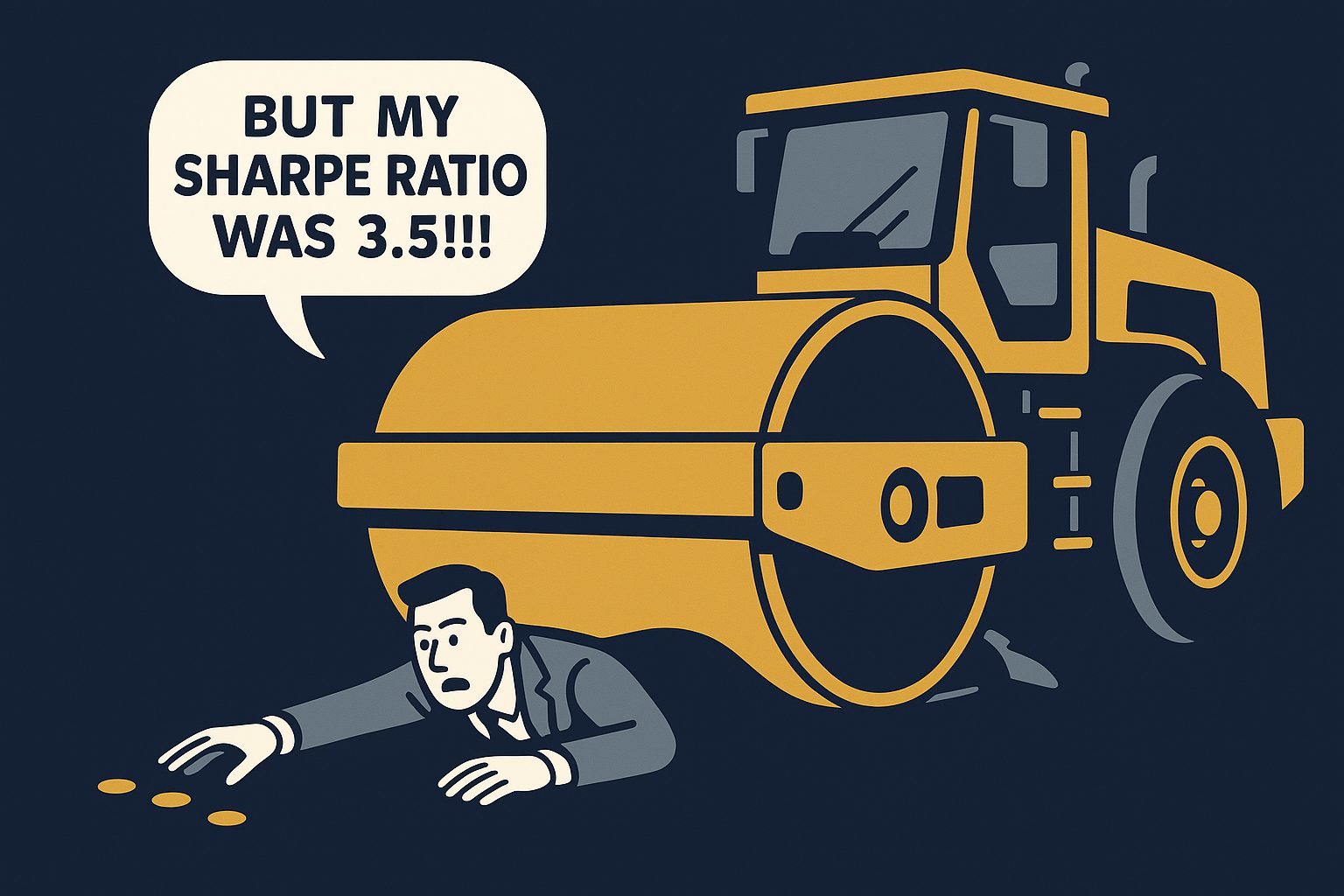
I once met a trader who was living exactly this way. He had learned from an options guru, he was making around $40,000 a month selling leveraged out-of-the-money puts, living entirely off his trading, and driving a Ferrari he had bought on a loan against his trading income. Every time I saw him he told me how well it was going and how confident he was. His strategy had a high win rate and a high Sharpe ratio, right up until a single stock gapped through his strike, the leverage wiped him out, and he lost everything in one trade. The Ferrari and the rest were repossessed, and he gave up trading altogether. He never understood the catastrophic risk built into the strategy, because the Sharpe ratio, the win rate, and years of live results all told him it was safe.
That single blind spot is why I anchor my system evaluation on drawdown-based metrics instead.
What should you use instead of the Sharpe ratio?
Instead of relying on the Sharpe ratio, use metrics that respect the difference between upside and downside, and that put drawdown front and centre. Here are the three I reach for, in order of how much I lean on them.
| Metric | Formula | What it fixes | When I use it |
|---|---|---|---|
| Sortino Ratio | Excess return / downside deviation | Only penalises downside volatility, so big winners no longer hurt your score | When I want a risk-adjusted number but do not want to punish upside |
| MAR / Calmar Ratio | CAGR / maximum drawdown | Measures return against the pain you actually experience | My preferred single metric for system quality |
| Ulcer Index / UPI | Return relative to depth and duration of drawdowns | Captures how deep and how long drawdowns last, not just their existence | When comparing the “trader survivability” of two similar systems |
The Sortino ratio is the simplest fix. It replaces standard deviation with downside deviation, so it only penalises the variability that actually hurts you – the downside. A trend system with big winning outliers is no longer punished for its best trades.
But my preferred single metric is the MAR ratio: compound annual return divided by maximum drawdown. It directly measures return relative to the worst peak-to-trough loss you would have had to sit through. I want the smoothest equity curve possible, something closer to a ruler heading up than a rollercoaster, because high returns with violent drawdowns are not tradeable for most people. They quit at the bottom. The MAR ratio rewards exactly the quality I care about.
What is a good MAR ratio for an end-of-day stock system?
Here is how I frame the MAR ratio for a realistic end-of-day system:
| MAR Ratio | Interpretation |
|---|---|
| Below 0.5 | Questionable – a lot of drawdown risk for the return. Investigate the logic. |
| 0.5 to 0.8 | Acceptable, especially for higher-return trend systems |
| 0.8 to 1.0 | Good – this is the target zone |
| Above 1.0 | Excellent, and hard to achieve consistently across a long backtest |
To put a real number on it, a NASDAQ 100 rotational system I have used in training ran at roughly 32% compound annual return with a 38% maximum drawdown – a MAR of about 0.84. That is a solid, tradeable result. Target 0.5 as a minimum to consider trading a system live, aim for 0.8 or better, and if you are genuinely above 1.0, make sure it is robust across 2000, 2008, 2020 and recent volatility rather than curve-fitted to one lucky period.
The three survivability tests that matter more than any ratio
Before any ratio, a system has to pass three survivability tests. This is the framework I actually use, and no single number captures it.
1. Financial survivability. Can your position sizes stay economically viable through the worst drawdown? If your account drops 40% and your positions become too small to overcome commission drag, the system breaks in practice even if the strategy is sound. Work backwards from the minimum viable dollar allocation per position to find your floor. A drawdown calculator is a fast way to model what different drawdown depths do to your capital.
2. Psychological survivability. If you watched a 35% drawdown unfold in your live account – not on a backtest, in real money – would you keep taking the signals? Most people badly overestimate their tolerance here. Ask yourself the honest question: what is the largest drawdown I could sit through and still trust the system enough to take the next trade?
3. Time survivability. How long did the worst drawdown last? A 30% drawdown that recovers in three months is a completely different experience from one that grinds on for 18 months. The longer the recovery, the higher the chance you abandon the system right before it pays off.
When I evaluate a system, I look at its historical maximum drawdown and then ask: what if the next one is 50% worse than anything in the backtest? Because markets can always surprise you, and your maximum drawdown is always ahead of you. If that scenario still keeps me financially and psychologically in the game, the system is survivable.
How do you rank systems for a portfolio using these metrics?
You rank systems by what they contribute to the whole portfolio, not by how good they look alone. This is the single biggest mistake I see: traders rank systems by their individual Sharpe ratio, allocate the most capital to the “best” one, and end up with a fragile, concentrated portfolio.
A system that looks mediocre on its own can be the best possible addition to your portfolio because of how it combines with what you already trade. The way to see this is to pull each system’s daily equity curve and daily exposure into a portfolio of systems and rebuild a blended equity curve. The question you ask when adding a system is not “what is its Sharpe ratio” – it is “does the combined portfolio drawdown fall, and does the combined return hold up or improve?” If yes, the system earns its capital allocation. If it looks great standalone but does not improve the combination, it does not make the cut.
This is also why genuine diversification matters more than any single metric: different markets, different timeframes, different directions, and different logic (trend following versus mean reversion) give you the uncorrelated exposure timing that actually smooths the equity curve and shrinks the drawdown the Sharpe ratio was never watching.
Don’t optimise your system to a single number
The deepest lesson in all of this is simple: never optimise a trading system to maximise a single metric, and that includes the Sharpe ratio. Chase one number and the software will hand you a curve-fitted mess that exploited historical quirks and dies in live trading.
Look at multiple performance measures at once – drawdown, risk-adjusted return, percent winners, and the shape of the equity curve. Choose stability over peak performance by picking parameters from a broad, consistent plateau rather than an isolated spike. Make sure you have enough trades to be statistically meaningful. Validate on out-of-sample data. And optimise position sizing last, separately from your system rules. The question is always “what rules give the greatest chance of future profitability,” not “what worked best in the past.”
The Sharpe ratio can be part of that picture. It just should never be the whole picture, and it should never be the number you optimise toward.
Frequently asked questions about the Sharpe ratio
What is a good Sharpe ratio for a trading strategy? Above 1.0 is generally considered good and above 2.0 very good by industry convention. But for a single end-of-day stock system, a Sharpe ratio around 0.7 to 1.3 is realistic and perfectly tradeable. A single system showing a Sharpe above 3 is more likely curve-fitted than brilliant.
Is a higher Sharpe ratio always better? No. Because the Sharpe ratio penalises upside volatility, a system with big winning trades can show a lower Sharpe ratio while being an excellent, tradeable system. A higher Sharpe ratio is only better if you also confirm the drawdown, trade count, and out-of-sample stability are sound.
What is the difference between the Sharpe ratio and the Sortino ratio? The Sharpe ratio uses total volatility (standard deviation) in the denominator, penalising both upside and downside moves. The Sortino ratio uses only downside deviation, so it penalises only the volatility that loses you money. For trend following and other systems with large winners, the Sortino ratio is usually the fairer measure.
Is the Sharpe ratio reliable for short-term traders? It is less reliable the shorter your timeframe, because short-term return distributions are more skewed and fat-tailed, and the annualisation from high-frequency data can distort the number. At Enlightened Stock Trading we focus exclusively on end-of-day systems, where drawdown-based metrics like the MAR ratio give a more honest read than the Sharpe ratio.
What does a negative Sharpe ratio mean? It means the strategy returned less than the risk-free rate over the measurement period. The precise value of a negative Sharpe ratio is not meaningful, because volatility distorts it when returns are negative. Treat it as a simple signal that the system did not earn its keep over that window.
Use the right metrics, then build systems worth measuring
The Sharpe ratio is a tool, not a verdict. Understand it, use it as one quick sanity check, and then judge your systems the way a trader who has to live through the drawdown would: by return relative to the pain, by whether you can financially and psychologically survive the worst case, and by what each system contributes to a diversified portfolio.
Knowing which metrics to trust is exactly the kind of thing that separates consistent, rules-based traders from the erratic majority. If you are the kind of analytical person who wants to build proven, backtested systems and evaluate them properly – instead of chasing one seductive number – that is precisely what we teach inside the Trader Success System. It is the structured path to building a portfolio of systems with an equity curve like a ruler heading up.